You Can Check The WhatsApp’s New Upcoming Design Feature
WhatsApp has been making subtle changes to the app’s interface in recent months, but a much bigger overhaul is on the way, the WABetaInfo team noted.
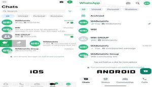
As always, this upcoming change was discovered in the beta version of WhatsApp for Android (2.23.18.18) and iOS (23.17.1.77). Both versions of the app get a revamped design with new colors, new buttons, and the ability to filter chats. Check out the screenshot below:

As the image shows, the biggest changes include a color change for the top bar and navigation tabs at the bottom of the screen. It’s unclear whether you’ll be able to switch between all tabs like before, but we don’t expect WhatsApp to take two steps forward and one step back.
There’s also no word on the new design’s dark mode, but we suspect the bottom and top will also blend more closely with the rest of the chat screen’s dark colors. There are many other rounded edges to complete the look.
In addition, we get a filter option for our chat screen that allows us to sort them by unread messages, personal conversations, or work chats on both iOS and Android. iOS users also get a handy personal chat button in the bottom navigation bar that isn’t available on Android.
Since the updated theme was already available to everyone in the beta version of WhatsApp, it will most likely be released in the stable version soon. Stay tuned.

